Figures
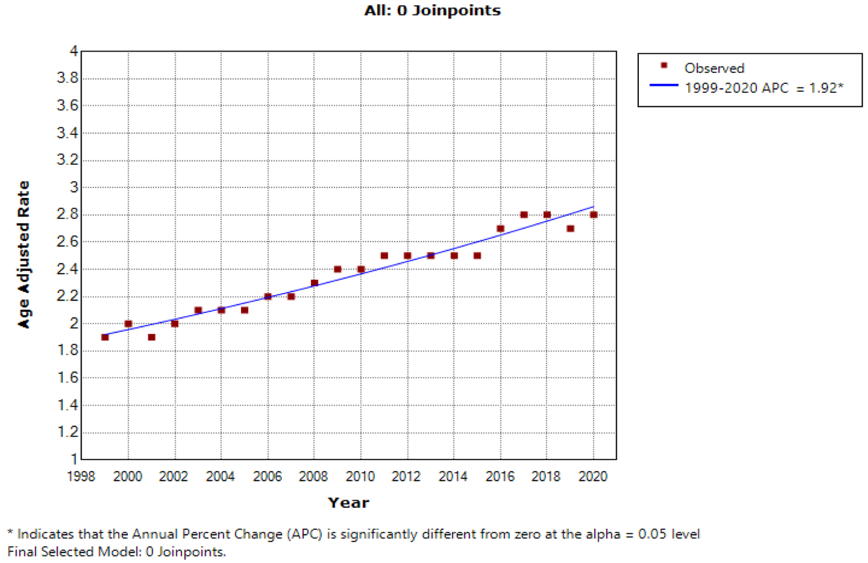
Figure 1. The age-adjusted mortality rate (AAMR) for hepatocellular carcinoma (HCC) per 100,000 population exhibited a significant upward trend over the two-decade study period in the USA for the general population, with the x-axis representing the year and race, and the y-axis indicating the AAMR.
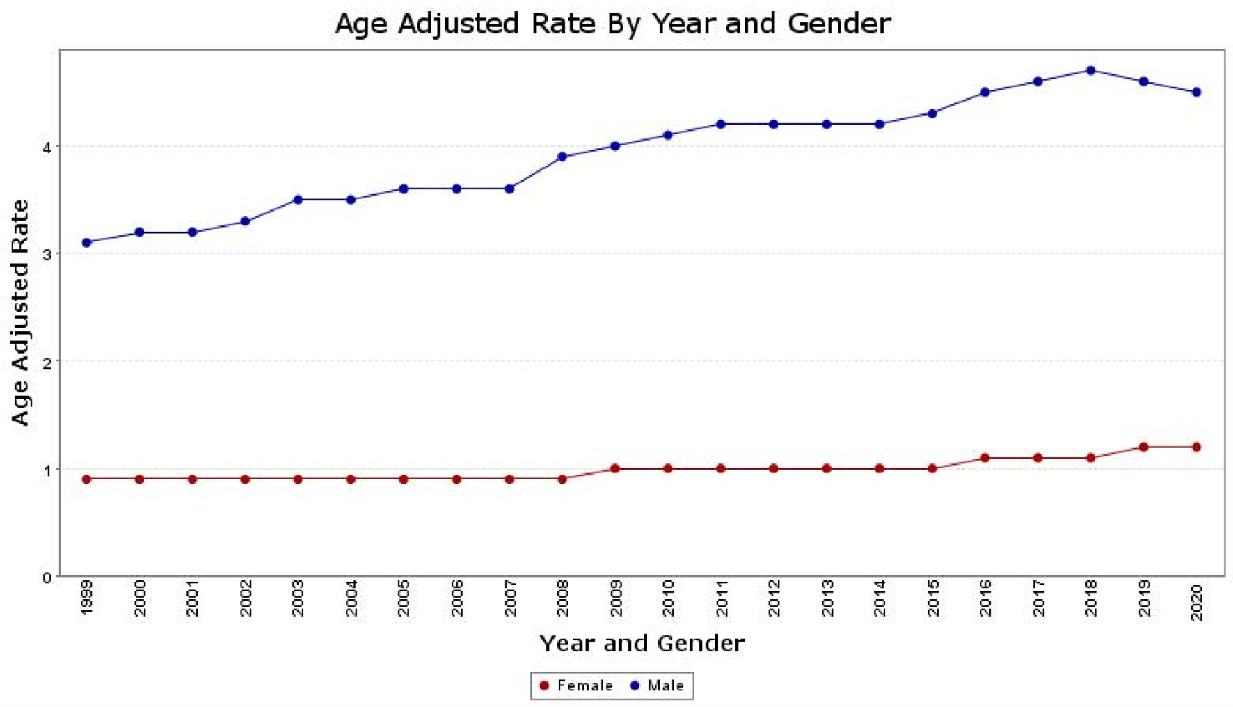
Figure 2. The age-adjusted mortality rate (AAMR) for hepatocellular carcinoma (HCC) is depicted separately for males and females on the graph. The y-axis represents the AAMR values, while the x-axis indicates the years from 1999 to 2020. There is an observed increase in AAMR for men, rising from 3.1 in 1999 to 4.5 in 2020. Similarly, for women, the AAMR increased from 0.9 in 1999 to 1.2 in 2020, indicating an overall worsening trend in the AAMRs for both sexes.
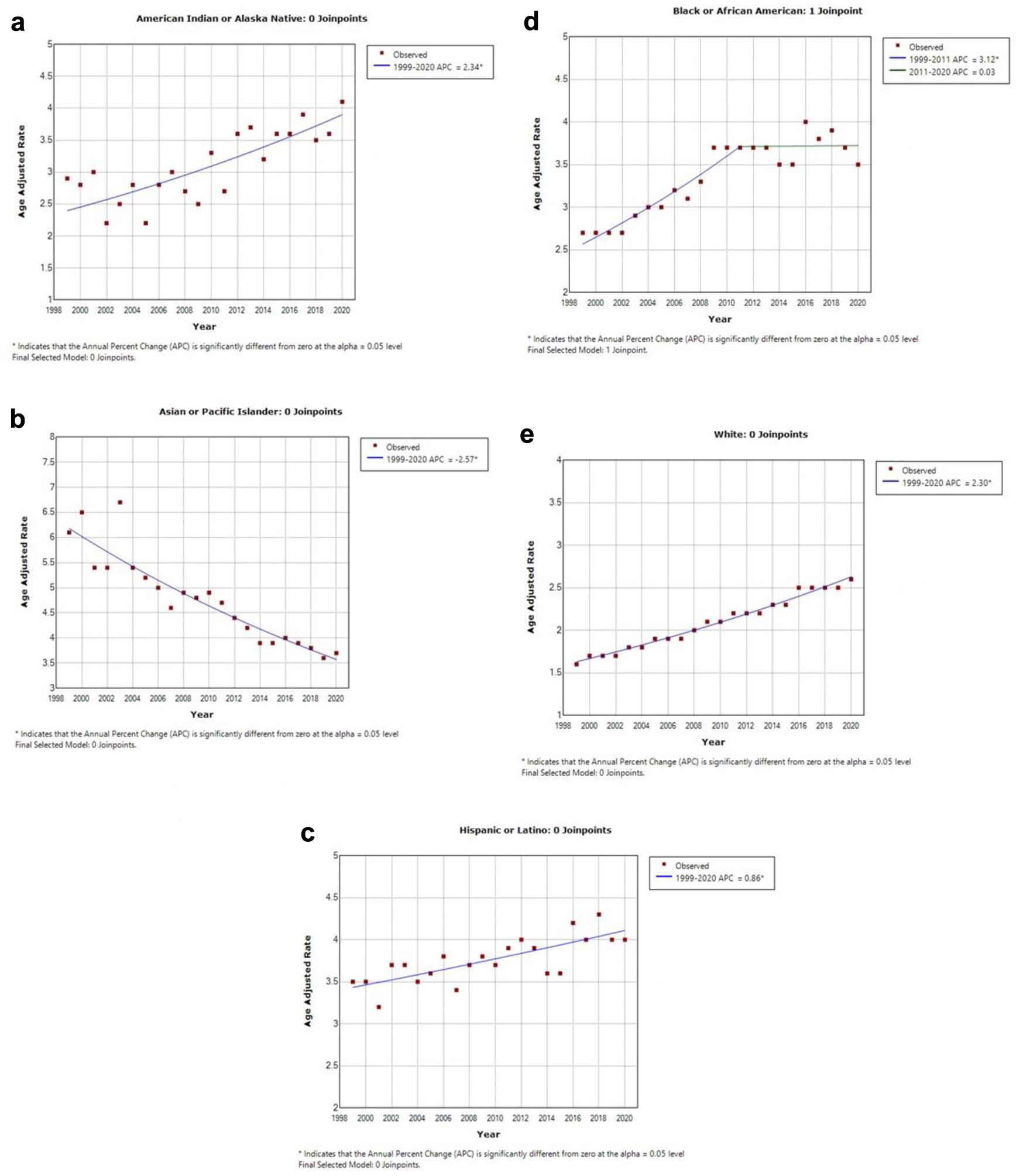
Figure 3. This illustration contains five graphs depicting the age-adjusted mortality rate (AAMR) within different ethnic groups. The y-axis represents the AAMR values, while the x-axis indicates the years from 1999 to 2020. (a) AAMR for American Indian or Alaska natives, which was 2.9 in 1999 and increased to 4.1 in 2020. (b) AAMR for Asian or Pacific Islanders, which declined from 6.1 in 1999 to 3.7 in 2020. (c) AAMR for Hispanic or Latino individuals, which increased from 3.5 in 1999 to 4.0 in 2020. (d) AAMR for Black or African American individuals, demonstrating an increase from 2.7 in 1999 to 3.5 in 2020. (e) AAMR for White individuals, which increased from 1.6 in 1999 to 2.6 in 2020.
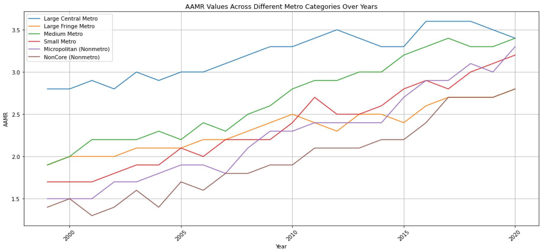
Figure 4. The age-adjusted mortality rate (AAMR) for hepatocellular carcinoma (HCC) is illustrated as a trend over time for the degree of urbanization. The y-axis represents the AAMR values per 100,000, while the x-axis indicates the years from 1999 to 2020.
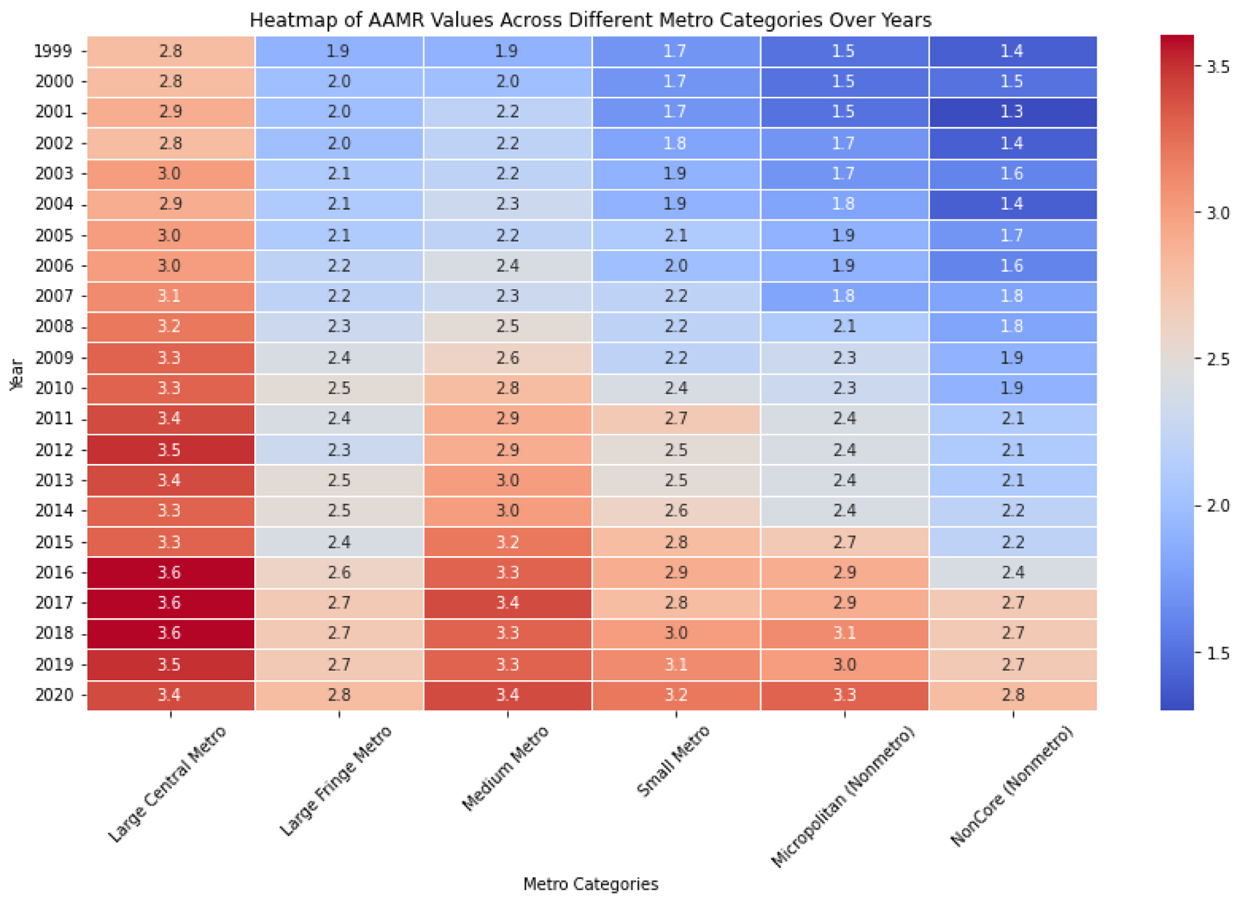
Figure 5. The heat map employs color intensity to depict the magnitude of age-adjusted mortality rate (AAMR) values, offering a concise visual summary of the data. Deeper hues signify elevated AAMR values, whereas lighter shades denote lower values. This visualization facilitates the quick comparison of AAMR across various metropolitan categories and years with a single glance.
Table
Table 1. Classification Rules Used to Assign Counties to the Six Urbanization Levels of the 2006 NCHS Urban-Rural Classification Adapted From Centers for Disease Control and Prevention (CDC) WONDER [16]
| Urban-rural category | Classification rules |
|---|
| aThere must be at least one large central county in each large metro area. |
| Metropolitan | |
| Large central metroa | Counties in a metropolitan statistical area of 1 million or more population: 1) that contain the entire population of the largest principal city of the metropolitan statistical area or; 2) whose entire population resides in the largest principal city of the metropolitan statistical area or; 3) that contain at least 250,000 of the population of any principal city in the metropolitan statistical area |
| Large fringe metro | Counties in a metropolitan statistical area of 1 million or more population that do not qualify as large central |
| Medium metro | Counties in a metropolitan statistical area of 250,000 to 999,999 population |
| Small metro | Counties in a metropolitan statistical area of 50,000 to 249,999 population |
| Nonmetropolitan | |
| Micropolitan | Counties in a micropolitan statistical area |
| Noncore | Counties that are neither metropolitan nor micropolitan |